What is a Lead Generation Landing Page?

A landing page asks a visitor to do one focused thing. Sometimes that action is a purchase. On a lead generation landing page, the immediate goal is smaller but just as valuable: earn enough trust for the visitor to share contact information.
The strongest pages connect an advertisement or email to one clear promise, a concise explanation, and a submission form that feels worth completing. This guide explains landing webpage design, headlines, content, marketing consistency, calls to action, chatbots, and practical examples you can use to generate more leads.
What Is a Lead Generation Landing Page?
A landing page is a campaign-specific web page that a visitor reaches after following a link from digital marketing, such as a search advertisement, social post, partner referral, or email. Unlike a homepage, it limits navigation and distractions so the visitor can understand the offer and decide what to do next without searching the website for ages.
The term “landing page” is used widely in digital marketing because a user lands directly on the page after following a campaign link. Sometimes a landing page is represented as a separate page with no connection to the homepage, especially in cases when a particular group of people is targeted and other visitors are not supposed to reach that page through normal navigation.
There are various types of landing pages, though they can be divided into two major groups. Pages of the first type take a consumer directly toward a purchase. Lead generation landing pages request contact details and create a contact point for follow-up. The data collected often includes email, name, company, and phone number, then flows into an internal customer management system or other lead generation tools.
Another type stands for direct-response purchase pages, but the main purpose here is creating leads or prospects by collecting personal information. That approach allows for creating contact points and putting those into the internal customer management system. The data collected usually includes email, name, company, and phone number, though every field should earn its place.
That distinction affects the entire page. A purchase page must resolve enough questions for a transaction, while a lead-capture page must justify an exchange of personal information. Ask only for data you genuinely need, explain what the visitor will receive, and connect collection practices to a clear website privacy policy.
How Do You Get More Leads With Landing Pages?
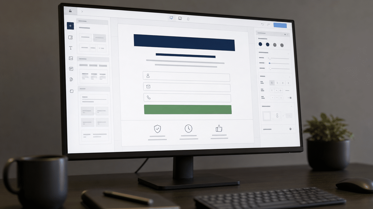
Before designing a landing page, decide what would increase conversion rates for this specific target audience. The goal isn’t to include every possible benefit. It is to remove uncertainty around one offer, one audience, and one next step while making the experience trustworthy on desktop and mobile devices.
Landing Webpage Design
Keep the page as concise as possible while giving visitors enough information to make a decision. Extra navigation, competing buttons, decorative animation, and unrelated offers can distract users. Brand colors, visual units, and font settings should align with the homepage and broader website so the campaign feels legitimate rather than disconnected.
Before starting to draft an outline, keep in mind that unnecessary elements can pull attention away from the offer. Use the brand colors, units, and font settings that align with the design of your homepage and entire website, then check spacing, contrast, and tap targets on a phone as well as a desktop monitor.
Good design also makes the form easy to use. The W3C guidance for accessible forms recommends simple forms, clear labels and instructions, and requesting only the information that is needed. A short form with a single field may suit a newsletter-style resource, while a complex business inquiry may justify company, role, phone number, and qualification details.
Landing Page Headlines
A catchy and concise headline should state the purpose of the page and the benefit for the visitor. Place it where it is clearly visible, then support it with one sentence that explains who the offer is for, what it provides, or why it matters. Clever wording isn’t useful if a person can’t tell what will happen after completing the form.
Landing Page Content
There is no need to throw a lot of text onto the landing page copy. Use a short description of the feature, service, product, or resource, then show the most relevant benefits and answer likely objections. Visitors should be able to scan the page, understand the value, and find the call-to-action button without digging.
Specific language usually earns more attention than broad claims. Explain what the visitor receives, how quickly it arrives, and what commitment is involved. If the offer is a consultation, describe the conversation. If it is a guide or template, show what is inside. This clarity can help engage your customer without overloading the page.
Marketing Consistency
The alignment of your advertisement or email with the context of the landing page is crucial. Repeat the same core offer, audience, and next step. Google Ads also recommends keeping the ad and landing-page call to action consistent in its guidance on matching ads to landing pages.
When the message is consistent, visitors can confirm quickly that they arrived in the right place. That continuity can enhance the customer experience and support trust. Promising something in an advertisement that is missing from the page creates friction and may undermine your reputation.
Business Partners and Affiliation
Relevant proof can reduce uncertainty, especially for startups and unfamiliar brands. Brand logos of partner companies, customer quotes, security information, professional memberships, and concise statistics may help when they are current and verifiable. Don’t fill the page with every partnership your company has established. Choose evidence that directly supports the offer and target audience.
Call To Action (CTA)
A call to action is a must because the page exists to prompt a further action. On lead generation landing pages, the CTA usually submits the form, starts a booking flow, requests a quote, or delivers a resource. Its label should describe the result, such as requesting a demo or getting the guide, instead of using a vague word such as “Submit.”
Place the primary CTA near the form and repeat it only when the page is long enough to require another decision point. Button color should stand out from the surrounding design without breaking the brand. After submission, confirm what happened and what the potential prospects should expect next.
Chatbot
A chatbot is optional. It can help when visitors have a predictable question about eligibility, pricing, scheduling, or the product or service. It can also distract from the submission form when it opens too aggressively, covers the CTA on mobile, or asks for the same contact information twice.
Treat conversational assistance as a test rather than a guaranteed improvement. Compare form completion, qualified leads, and follow-up outcomes with and without it. The right implementation supports the primary action; it doesn’t become a second landing page competing for attention.
What Can You Learn From Lead Generation Landing Page Examples?
Each landing page is created for a certain purpose, so useful analysis begins with the audience and requested action. Brand pages change often, and the examples below are best understood as design lessons rather than permanent scores. Look for the same fundamentals in every version: a clear headline, relevant benefit, manageable form fields, visible CTA, consistent message, and credible proof.
Before exploring the samples of landing pages provided below, consider what each page is paying attention to and what further actions are expected. The purpose is not to declare a page exceptionally perfect. It is to determine what is done in an effective way and what points for improvement could strengthen the experience.
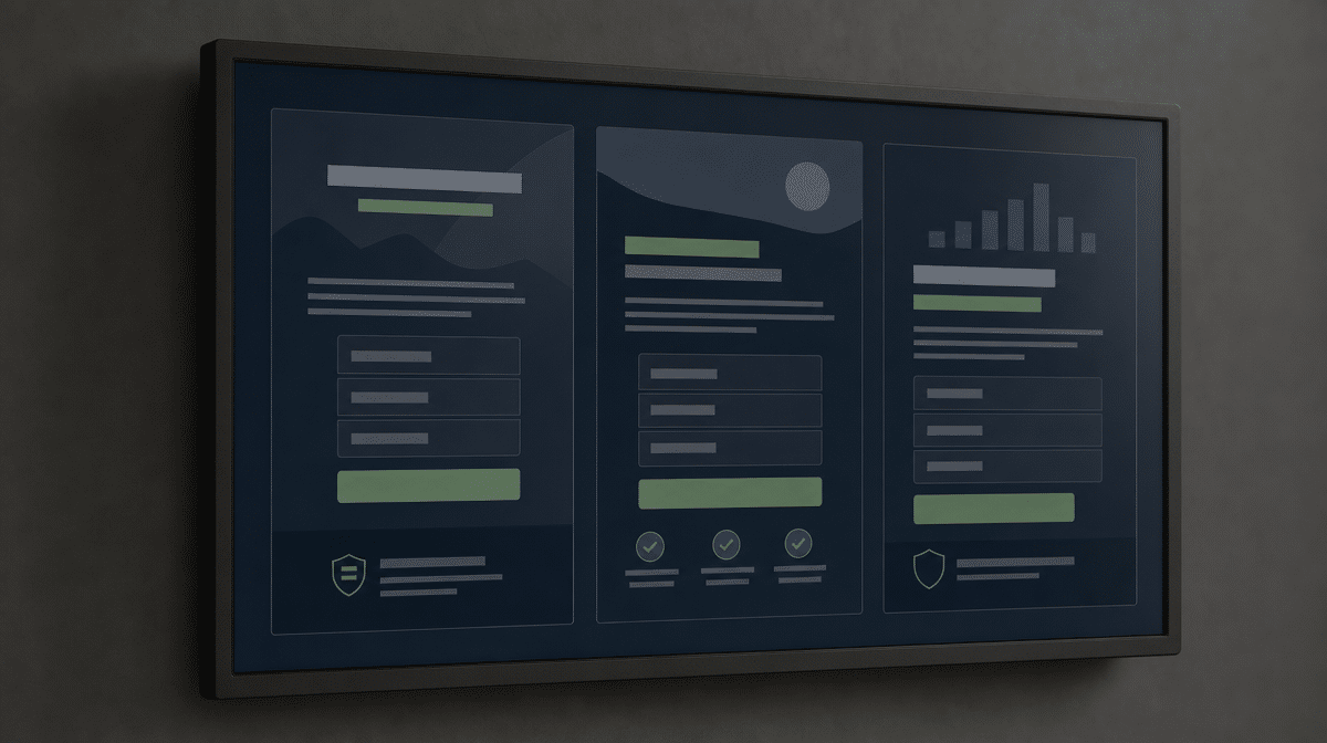
Adobe Commerce, Formerly Magento
Magento, now represented by Adobe Commerce while Magento Open Source remains active, illustrates the value of matching form length to the offer. The original example highlighted a simple form with a single field and brand logos of partner companies. Those concepts still matter: lower friction can increase participation, and relevant proof can reassure visitors who do not yet know the platform.
The caution is equally useful. A headline must emphasize the benefit, and the call-to-action button must be noticeable. A polished page can still underperform when people cannot tell why they should respond or where to act.
Uber
Uber’s driver-acquisition pages show why audience clarity comes first. The headline should clearly state that the page is for people considering driving, while the onboarding flow can gather required documents and city-specific details in stages. Links for car rentals or other adjacent services may be useful, but they should not compete with the primary driver action.
Airbnb
Airbnb’s host experience demonstrates benefit-led acquisition. Future hosts need to understand potential value, what hosting involves, and how to begin. An earnings estimator or concise explanation can make the opportunity tangible, while a staged listing flow keeps a complex process from becoming one intimidating form.
The broader lesson is to keep momentum after the CTA. Whether you embed the form on the same landing page or use a staged flow, preserve the promise and visual context so visitors do not feel they have been sent somewhere unrelated.
Lidl
A supplier-focused Lidl page has a narrower audience than a consumer promotion. It should explain which type of suppliers Lidl is looking for, the benefits Lidl can offer, and the information needed for an initial review. Statistics, numbers, and facts can increase trust when they are current and relevant.
The submission form should still respect effort. If qualification requires many fields, group them into logical steps, distinguish required from optional information, and explain why sensitive or detailed data is requested. A long form is easier to accept when the value and process are clear.
Hexagon Apartments
The original Hexagon Apartments example was not overloaded with information and centered on a call-to-action button for booking an appointment. The lasting lesson is that visual simplicity alone is not enough. A property page should include several concise sentences explaining what makes the apartments relevant to future prospects, then keep unrelated elements from pulling attention away from the viewing request.
How Should You Improve a Lead Generation Landing Page?
Start with the promise that brought people to the page. Make the headline and content consistent with the campaign, remove unnecessary elements, request only useful contact details, and make the call to action obvious. Then test the page on common mobile and desktop sizes before sending traffic.
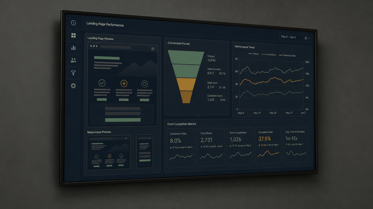
Measure more than raw form submissions. Review conversion rates, lead quality, follow-up speed, and the share of potential prospects who become real sales opportunities. A landing page benefits your business goals when it creates useful conversations, not when it merely produces the largest possible list of names.
Frequently Asked Questions
What Is a Lead Generation Landing Page?
A lead generation landing page is a campaign-specific page that asks a visitor to share contact information in exchange for a relevant offer, resource, conversation, or next step.
What Information Should a Lead Generation Form Collect?
Collect only the information needed to deliver the offer and support follow-up. Common fields include email, name, company, and phone number, but the right fields depend on the offer and qualification process.
How Many Fields Should a Landing Page Form Have?
Use the fewest fields that support the next step. A simple resource may need only one or two fields, while a qualified business inquiry may require additional company and role information.
What Makes a Landing Page Convert?
Strong conversion pages match the campaign message, state a clear benefit, use concise content, provide relevant proof, minimize form friction, and make the primary call to action easy to find.
How Should You Measure Landing Page Performance?
Track conversion rates, form abandonment, qualified lead volume, follow-up outcomes, and eventual sales opportunities. The best page creates relevant prospects, not just more submissions.