What are the Different Levels of Process Mapping?

A process map can settle an argument about how work happens, or start a more useful one about how it should happen. The result depends on the level and type of map you choose, because a map built for executive consensus cannot carry the same detail as one built to diagnose a missed hand-off.
Process maps capture and display information about the current state of your business process and help to communicate the steps in a process. Different types and levels used in business process mapping focus on different questions, from who owns each hand-off to which activities add customer value. What are the different levels of process mapping, and which map is best for the job?
What Are the Different Levels of Process Mapping?
The level of a process map describes its scope and degree of detail. A high-level process map shows the entire process through a small number of major stages, while a low-level process map shows detailed activities, documents, decisions, order, and direction of flow. Both depict the same work, though from different angles and for different audiences.
The remaining names in the seven-map framework describe the information shown or the visual format rather than another level of detail. Swim lane maps stress roles, responsibilities, boundaries, and hand-off points. Document maps list the documents and records generated throughout a process. Activity maps display information about the relative worth or value of activities, while workflow diagrams and rendered maps turn the sequence into a visual story.
Start with the decision the map must support. A leadership group may need a concise Supplier, Input, Process, Output, Customer view to establish boundaries and build consensus. The people who perform the work may need every decision, document, exception, and hand-off. The information shown and the best use should determine the level, not the amount of detail the mapping software can hold.
How Do Process Maps Set the Stage for Change?
Each process map depicts the entire process, though from different angles. For example, swim lane maps stress roles, responsibilities, and hand-off points, whereas document maps list documents and records generated throughout a process. Activity maps display detailed information about what is occurring and the relative worth or value of activities.
Activity maps may show process steps in columns, with activities within each step or column. Activities can be color-coded according to the value customers might derive from them, including value-added and non-value-added activities. Non-value-added work should be challenged, reduced, redesigned, or eliminated when it does not satisfy a legal, control, safety, or risk requirement.
Assigning a value to activities is, by nature, subjective. An analyst may rationalize a value judgment by attributing it to the customer, but that shifts responsibility for the judgment and may ensure that activities that should be cut are not. Test the judgment with the people who perform the work and the people who receive its output. Their evidence can separate necessary controls from delays, rework, and waste.
What Information Do the Seven Process Maps Show?
Let’s recap the seven process maps. The following table lists the information each map reveals and the best use for each. The map names and sequence are preserved because together they move from high-level consensus to detailed analysis, job aids, and a compelling case for improvement.
| Map Name | Information Shown | Best Use |
|---|---|---|
| High-Level Process Map | Suppliers, Inputs, Process, Outputs, Customers (SIPOC) | Building consensus on high-level process steps and establishing clear hand-offs. ASQ’s SIPOC guidance describes it as a concise view of the current process and its boundaries. |
| Low-Level Process Map | Detailed scope, documents, decisions, order, and direction of flow | Looking for missing steps and gaining clarity on how the work is best performed. |
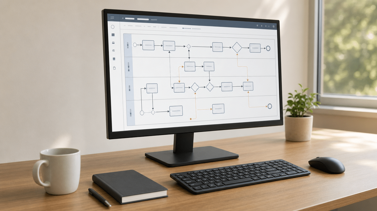
| Swim Lane Process Map | Roles, responsibilities, boundaries, and hand-offs | Establishing responsibilities and making cross-functional hand-offs visible. |
| Document Maps | Documents that are inputs and outputs at each process step | Creating an inventory or guide to documents that support a process, especially when preparing for audits and compliance regimes. |
| Activity Process Map | Detailed activities at each process step, including value-added and non-value-added activities | Leaning out a process, looking for waste, and testing which activities create customer value. |
| Workflow Diagram | The work process shown in an iconic flow fashion | Creating a job aid that can be easier to relate to than a flow diagram built with more formal Unified Modeling Language symbols. |
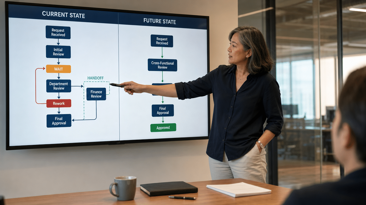
| Rendered Process Map | The current state and future state arranged to highlight potential improvements | Using a storytelling device as part of the report-out of an analysis. |
Moving From Process Observation to Process Improvement
Descriptive process maps help capture the current state. Activity maps help collect detailed information about what is occurring. Teams use them to reduce the number of steps and make the process lean. ASQ’s value stream mapping guidance similarly distinguishes value-added work from waste and connects a current-state map with a future-state design.
Convincing others to accept a professional judgment often requires changing minds and showing people a new way to work. The analyst must move beyond simply describing a process to tell a story that illustrates a point of view. A rendered map can show enough information to persuade an audience while keeping the evidence visible. The objective is to “inform to persuade,” not to hide inconvenient facts.
Everyone has biases and a personal set of filters. This is commonly discussed in relation to news media, but a person’s relationship to a business process colors judgment, too. Comparing a shared current state with an agreed future state gives those perspectives somewhere concrete to meet. APQC’s process-mapping guidance also frames the next level as moving from current-state capture toward a future state that supports improvement.
Choosing the Right Process Map for the Job
As an analyst, quality professional, change manager, or executive, your role is to collect and sift through information, form a qualified, professional opinion, and present a compelling case for improvement. Your audience does not have the perspective created by mapping the entire process. They may know more about their specific area, department, or function, but interviews capture key aspects of that knowledge and reveal boundaries between functions.
When the facts are analyzed and the mapping is done, make the case with the right process map for the job. Show people what must happen in step, in time, and with significant potential impact. Use a high-level map to establish scope, a low-level or activity map to diagnose the work, and a rendered map when the change needs a shared story. That sequence also helps teams avoid common process mapping mistakes.
Frequently Asked Questions
What Are the Different Levels of Process Mapping?
High-level maps summarize major stages and boundaries, while low-level maps show detailed activities, documents, decisions, order, and direction of flow. Other map names describe the lens or format used to show the process.
How Is a High-Level Process Map Different From a Low-Level Process Map?
A high-level map often uses SIPOC to build consensus on scope and clear hand-offs. A low-level process map adds the detail needed to find missing steps, decisions, exceptions, and supporting documents.
When Should You Use a Swim Lane Process Map?
Use a swim lane process map when roles, responsibilities, boundaries, and hand-offs are central to the problem. The lanes make ownership and cross-functional transfers visible.
How Do Activity Maps Identify Waste?
Activity maps classify detailed work as value-added or non-value-added from the customer’s perspective. Teams can then reduce, redesign, or remove waste while preserving work required for law, controls, safety, or risk.
How Do Rendered Process Maps Support Change?
Rendered process maps compare the current state and future state as a storytelling device. They help an analyst inform to persuade by making the evidence, improvement direction, and expected impact easier to discuss.