Types of Process Maps (And When To Use Each)

Ask five people in the same department to describe how a routine request moves through their team and you will usually get five different answers. Everyone is confident, everyone is partly right, and nobody agrees on where the work actually waits. That disagreement is not a people problem. It is what happens when a process exists only in habit.
A process map fixes that by putting the work on paper. The complication is that process map is not one thing. It is a family of diagrams, and each member of that family answers a different question. A map that is perfect for a board briefing is useless for finding a bottleneck, and a map that exposes every handoff will bury an executive in detail.
This article defines what a process map is, walks through the nine types that businesses actually use, and explains when each one earns its keep. It closes with the selection mistakes that waste the most time and a short method for building your first map.
What Is a Process Map?
A process map is a visual representation of the steps, decisions, inputs, and outputs that make up a business process, drawn in the order the work happens. It shows who does what, in what sequence, and where the work moves from one person or system to another.
The purpose is shared understanding. A written procedure describes a process in sentences that people read once. A map shows the same process as a shape, and a shape is something a team can argue about productively. Gaps, loops, and redundant approvals become visible in a way that prose hides. For a fuller treatment of the discipline behind these diagrams, see our guide to business process mapping.
What Every Process Map Contains
- Activities: the individual steps performed, usually drawn as rectangles.
- Decisions: the points where the flow branches, usually drawn as diamonds.
- Sequence: arrows showing the direction the work travels.
- Boundaries: a defined start event and end event, so the scope is unambiguous.
- Owners: the role accountable for each step, either labeled or implied by a lane.
Everything beyond those five elements is what separates one type of map from another. Some types add timing data. Some add systems. Some add nothing at all, which is exactly why they work for the audience they serve.
How To Choose the Right Type of Process Map
Type selection is driven by the question you are trying to answer, not by the drawing tool you happen to own. Before choosing a format, settle three things: who reads the map, what decision it supports, and how much of the process is in scope.
- Audience: an executive wants five boxes; the person doing the work wants forty.
- Purpose: onboarding, compliance evidence, automation design, and waste reduction all pull toward different formats.
- Scope: a single task, an end-to-end workflow, or a whole value chain.
- Data appetite: whether anyone will actually collect the cycle times a data-heavy map demands.
If you are unsure, start simple. A basic flowchart that people read beats a value stream map that nobody finishes. Our discussion of the different levels of process mapping covers how detail should escalate as the work matures.
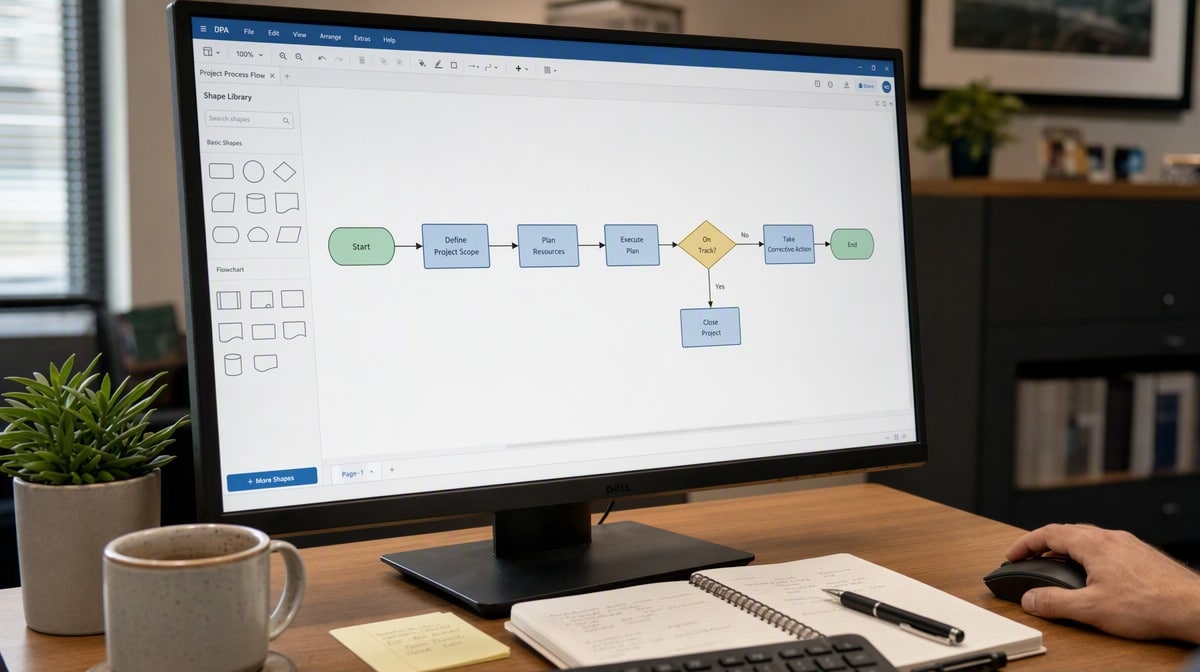
9 Types of Process Maps and When To Use Each
The nine formats below cover the overwhelming majority of business mapping work. They are ordered roughly from least to most detailed, which is also the order most organizations adopt them in.
1. High-Level Process Map
A high-level map, sometimes called a top-down or block diagram, reduces a process to between four and eight major stages with no decision points and no exceptions. It is the one-page answer to “what happens here?”
Use it when you are orienting a new employee, briefing an executive, or setting the boundaries of a mapping project before detailed work begins. Its weakness is that it cannot support analysis. There is nothing in a high-level map to fix, because everything that goes wrong lives in the detail it deliberately omits.
- Best for: orientation, scoping, executive communication.
- Avoid when: you need to diagnose a failure or design a change.
- Typical build time: under an hour.
2. Detailed Process Map
The detailed process map is the standard flowchart most people picture: every activity, every decision diamond, every branch, drawn with the conventional symbol set. A single process might expand into thirty or more shapes.
This is the workhorse format for writing procedures, training staff, and finding the loops where work doubles back. It is also where teams first discover that the official process and the real process diverged years ago. The trade-off is maintenance, since a detailed map goes stale the moment the process changes and nobody updates the diagram.
- Best for: procedure documentation, training, exception handling.
- Avoid when: the audience is senior and time-poor.
- Typical build time: one to three working sessions.
3. Swimlane Diagram
A swimlane diagram, also called a cross-functional or deployment flowchart, splits the map into horizontal or vertical lanes, one per role, department, or system. Each step sits in the lane of whoever performs it, and every arrow that crosses a lane boundary is a handoff.
Swimlanes are the single most useful format for processes that involve more than one team, because the crossings are where delay and error concentrate. If a purchase requisition crosses between requester, manager, finance, and purchasing six times, the diagram makes that obvious in a way no narrative can.
- Best for: cross-departmental processes, accountability disputes, handoff reduction.
- Avoid when: the whole process sits inside one role.
- Watch for: lane sprawl. More than six lanes usually means the scope is too wide.

4. SIPOC Diagram
SIPOC stands for Suppliers, Inputs, Process, Outputs, and Customers. It is not a flow diagram at all but a five-column table that frames a process before anyone maps it in sequence, with the middle column holding no more than seven summary steps.
Six Sigma teams use SIPOC at the define stage of a project to agree scope in a single meeting. It is fast, it forces the team to name who receives the output, and it prevents the common failure of mapping a process without knowing which customer it serves.
- Best for: project scoping, improvement kickoff, supplier and customer clarity.
- Avoid when: you already have agreement on scope and need flow detail.
- Typical build time: a single 60-minute workshop.
5. Value Stream Map
A value stream map documents the entire flow of a product or service from customer request to delivery, and annotates each step with operational data: cycle time, wait time, inventory, defect rate, and the number of people involved. A timeline along the bottom separates value-adding time from everything else.
It is the diagnostic instrument of lean practice, and the ratio it exposes is usually uncomfortable. Processes that take three weeks frequently contain a few hours of actual work. The United States Department of Commerce Manufacturing Extension Partnership publishes practical material on lean and process improvement that explains how the toolset is applied in operating businesses.
- Best for: lead-time reduction, waste identification, lean programs.
- Avoid when: nobody is willing to gather the timing data it requires.
- Typical build time: several days including floor observation.

6. Value-Added Flow Chart
A value-added flow chart is the lighter relative of the value stream map. It lists the process steps in sequence, records the elapsed time of each, and classifies every step as value-adding, business-necessary, or waste.
Because it needs only a stopwatch and a step list, it suits administrative processes where a full value stream map would be overkill. It is often the quickest route to an unarguable number, such as the discovery that eleven of nineteen steps in an invoice approval add nothing the customer would pay for.
- Best for: office and back-office processes, quick waste audits.
- Avoid when: the process spans multiple sites or complex material flow.
- Typical build time: one to two days.
7. Process Flow Diagram
The process flow diagram, or PFD, comes from engineering and manufacturing rather than office work. It maps the physical flow of material or product through equipment, showing tanks, lines, transformation points, and the major flows between them, usually with mass and energy figures attached.
Use it when the subject of the process is a physical thing rather than a document or a request. It is the correct format for production, chemical processing, and food manufacturing, and it is the wrong format for anything approval-driven.
- Best for: production and plant operations, equipment-centric processes.
- Avoid when: the process is administrative or decision-driven.
- Related discipline: often paired with piping and instrumentation diagrams for detailed engineering.
8. Data Flow Diagram
A data flow diagram shows how information moves between processes, data stores, and external entities. It deliberately ignores sequence and timing, answering “where does this data come from and where does it end up?” rather than “what happens first?”
Data flow diagrams matter when a process is being automated, when systems are being integrated, or when a privacy or records-retention question requires knowing exactly where personal data lands. Teams evaluating types of process automation generally need one before scoping any build, and our overview of business process automation covers what happens after the data picture is clear.
- Best for: system integration, automation design, data governance.
- Avoid when: the audience needs to know the order of human steps.
- Common levels: a context diagram first, then decomposition into level 1 and level 2.
9. BPMN Diagram
Business Process Model and Notation is a formal standard maintained by the Object Management Group. It uses a precise symbol vocabulary covering events, gateways, pools, message flows, and subprocesses, and a BPMN model can be executable rather than merely descriptive.
BPMN is the right choice when the map will drive a workflow engine, when several teams need to read a diagram identically, or when the process is complex enough that informal notation becomes ambiguous. The cost is a learning curve, and a BPMN model shown to an untrained audience communicates less than a plain flowchart would.
- Best for: workflow automation, complex processes, notation consistency at scale.
- Avoid when: the readers are frontline staff with no notation training.
- Prerequisite: at least one person on the team who knows the standard properly.
Which Process Map Type Fits Which Job?
The short version, in the order the question usually gets asked:
- Explain the process quickly: high-level process map.
- Write or revise a procedure: detailed process map.
- Fix handoffs between departments: swimlane diagram.
- Agree scope before an improvement project: SIPOC.
- Cut lead time: value stream map, or a value-added flow chart for office work.
- Improve a production line: process flow diagram.
- Automate or integrate systems: data flow diagram, then BPMN.
Most organizations end up maintaining two or three of these formats rather than standardizing on one. That is the correct outcome. The formats are not competitors; they are lenses on the same work.
Common Mistakes When Choosing a Map Type
Mapping the Process You Wish You Had
Teams routinely draw the approved procedure instead of the observed reality. The resulting map is tidy, agreeable, and useless for improvement. Map the current state from observation and interviews first, then draw the future state as a separate diagram.
Choosing Detail Before Choosing Audience
A thirty-shape flowchart handed to a director will be skimmed and forgotten. Decide who reads the map before deciding how granular it should be, and accept that one process may need two diagrams at two altitudes.
Treating the Map as the Deliverable
A diagram that never becomes a procedure, a training module, or a system configuration is decoration. The map earns its cost when the documented process changes what people actually do. This is the connection our discussion of the process approach to business process management develops in more depth.
Ignoring Notation Discipline
Mixed symbol conventions across a document set make maps unreadable to anyone but the author. Pick a symbol standard, write it down, and apply it consistently. Quality management systems built to the ISO 9001 quality management standard expect documented information to be controlled and legible, and inconsistent notation quietly fails that expectation.
Never Revisiting the Map
A process map has a shelf life. Assign an owner and a review date at the moment the map is published, or it will describe a process that stopped existing eighteen months ago.
How To Build Your First Process Map
A first mapping effort should be small enough to finish. Choose one process with a clear start, a clear end, and a person who complains about it regularly.
- Define the boundaries. Name the trigger event and the end state before drawing anything.
- Pick the format. Use the selection criteria above; when in doubt, start with a swimlane diagram.
- Gather the steps from the people who do the work. Interviews and observation, not the procedure binder.
- Draft the flow. Sticky notes on a wall first, software second. Rearranging paper is cheaper than redrawing shapes.
- Validate with the team. Walk the map step by step with the people who perform it and correct it live.
- Publish it into a system. Attach the map to the procedure it documents so the two stay together.
- Set a review date. Six or twelve months, with a named owner.
Teaching materials such as the Darden School case on business process mapping and waste analysis follow the same sequence, which is a reasonable signal that the order is not arbitrary.
Putting the Right Map To Work
Choosing a process map type is a five-minute decision that determines whether the next two weeks of mapping produce anything usable. High-level maps explain, detailed maps document, swimlanes expose handoffs, SIPOC scopes, value stream maps measure, and BPMN executes. Match the format to the question and the map does the work for you.
We find that most businesses under-map at the start and over-map later, drowning a simple process in notation nobody asked for. Start with the simplest diagram that answers the question in front of you, publish it where the work happens, and add detail only when a specific decision requires it.

Frequently Asked Questions
What Are the Main Types of Process Maps?
The main types are the high-level process map, the detailed process map, the swimlane or cross-functional diagram, the SIPOC diagram, the value stream map, the value-added flow chart, the process flow diagram, the data flow diagram, and the BPMN diagram. Each answers a different question, from executive orientation through to executable workflow automation.
Which Type of Process Map Is Best for Beginners?
A detailed process map or a swimlane diagram is the best starting point for most teams. Both use familiar flowchart symbols, require no specialist training, and expose the handoffs and decision points where problems usually sit.
What Is the Difference Between a Process Map and a Value Stream Map?
A process map shows the sequence of steps and decisions in a process, while a value stream map adds operational data such as cycle time, wait time, and inventory across the whole flow from request to delivery. The value stream map is a measurement instrument; the process map is a description.
When Should You Use a Swimlane Diagram?
Use a swimlane diagram whenever a process crosses roles, departments, or systems. Lanes make every handoff visible, which is where delay, rework, and accountability disputes concentrate in cross-functional work.
How Detailed Should a Process Map Be?
The level of detail should be set by the audience and the decision the map supports. An executive briefing needs four to eight blocks, while a map used to write a procedure or configure a workflow may need thirty or more steps with every exception branch shown.