What Quality Tools Are Used for Process Improvement?

There are seven Quality Tools you can and should use to understand and improve processes during a process improvement event. Each tool helps you identify sources of variation and aids in the analysis, documentation, and organization of the information, which leads to process improvement. What are those seven quality tools?
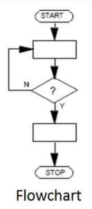 1. Flowcharts or Process Maps
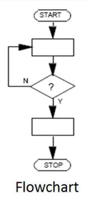
Flowcharts, or Process Maps, visually represent relationships among the activities and tasks that make up the process flow. They are typically used at the beginning of a process improvement event to describe the process task, timing, and frequencies at the highest level and work downward. At high levels, process maps help you understand process complexity. At lower levels the process map describes the Suppliers, Inputs, Process, Outputs, and Customer (SIPOC) of the process. The process map quality tool helps you analyze the process.
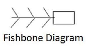 2. Ishikawa, Fishbone, or Cause & Effect Diagrams
Ishikawa, Fishbone, or Cause & Effect Diagrams visually represent the causes of a problem – or effect – and help you determine the ultimate source of the problem — the root cause. (This tool is called a “fishbone” diagram because of its appearance; see Quality Gurus) The cause-and-effect diagram is used at the beginning of root cause analysis, to organize the causes of a problem (people, methods, equipment, materials, measurement, and environment) and prioritize them.
3. Data Checklists, Check Sheets, or Recording Tables
Data Checklists, check sheets, or recording tables are matrices designed to assist in tallying, recording, and analysis of test results or event occurrences. These data checklists are a vital quality tool utilized in the process to gather or count defects and collect process data, which you analyze to identify opportunities for improvement. You can only manage what you measure so gathering data is the start to managing the process.
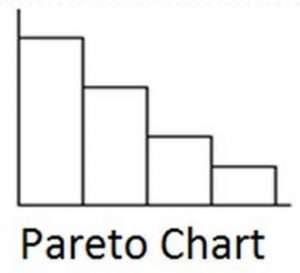 4. Pareto Charts
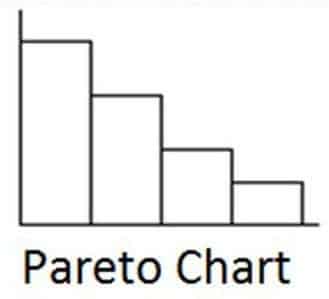
The Pareto chart is named after Vilfredo Pareto, who came up with the Pareto Principle (or the “80/20 rule”), which says that 20% of the factors account for 80% of potential problems. The Pareto chart ranks defects, causes, or data from the most significant to the least significant, in descending order. Out off all the quality tools, Pareto charts help you separate the “vital few” from the “trivial many”. They are typically used during process improvement analysis, to understand where to focus improvement for the greatest impact.
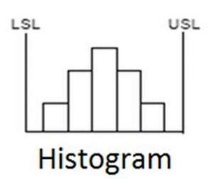 5. Histograms Charts
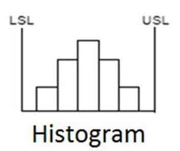
Histograms Charts consist of vertical bars, side-by-side, that depict frequency distributions within tables of numbers and can help you understand data relationships over time (e.g., the familiar “bell curve”). Histograms are generally used during process improvement analysis to understand the data and see what is going on in the process.

6. Scatter Charts
Scatter charts is another of the quality tools. These display relationships between dependent (predicted) and independent (prediction) variables. They are used during hypothesis testing, to determine if there is a possible correlation between two variables and how strong the correlation is. Less scattering indicates stronger correlation.
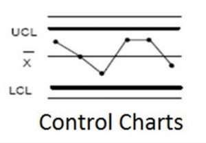 7. Control Charts

The control chart is a type of statistical process control (SPC) tool. Process performance is plotted over time against the process’ upper and lower control limits; this helps you readily detect process variations and enables determination of special cause and common cause variation. Control charts are used during production, or after process improvement implementations, to ensure that processes are within control limits, or “in control”.
Seven Quality Tools
To achieve the best results use the seven quality tools in order. Start by
(1) drawing up a process map, so you understand the process flow. Next,
(2) analyze the process flows for the primary causes of problems and develop your cause-effect diagram. Then,
(3) collect data using check sheets and
(4) plot your data using a Pareto chart and/or
(5) a histogram to visualize the data. Next,
(6) determine the relationship of various variables in your cause-effect chain using a scatter chart. Once you have solved your problem,
(7) use a control chart to ensure that the process is staying within process control limits — demonstrate process control.
That is how you use the Seven Quality Tools to understand and improve processes during a process improvement event. Each tool, used in order, helps you identify the sources of variation and aids you in your analysis, documentation, and understanding of the process, which leads you to an improved process.


Great! Very interesting.