How to Use Cause-Effect Diagrams to Solve Problems

Every process problem arrives as an effect before it is understood as a cause. A room is cold, a shipment is late, a defect rate rises, or a customer complaint keeps returning. The visible symptom gets attention first, but solving the symptom rarely fixes the process.
Cause-effect diagrams give a team a simple way to slow down, organize possible causes, and test the root cause before acting. They are one of the most useful quality tools for process improvement because they turn scattered observations into a structured problem-solving map.
What Are Cause-Effect Diagrams?
A cause-effect diagram is a visual tool for sorting the possible causes of a problem and showing how those causes may relate to the observed effect. The tool was developed in Japan in 1943 by Kaoru Ishikawa as a way to explain how many factors in a complex process can be grouped and examined. Cause-effect diagrams are often called fishbone diagrams because their branches resemble a fish skeleton, or Ishikawa diagrams after their inventor.
The American Society for Quality fishbone diagram guidance describes the method as a way to identify many possible causes for an effect or problem. That is the important point: the diagram does not solve the problem by itself. It makes the thinking visible so the team can decide which causes deserve investigation.

Brainstorming Causes and Effects
Cause-effect diagrams are extremely useful for organizing input from a brainstorming session. Brainstorming, to be effective, should be freewheeling and without judgments. Data is developed first, without forcing order, relationships, or relevance too early.
Once the data is captured, however, the team needs to sort it out and show the relationships. A simple diagram starts with one effect and one possible cause. The effect is the problem you can see. The cause is the factor you believe may be producing that problem.
That simple structure keeps the team from jumping straight to a favorite answer. If the problem is a cold room, the effect is occupant discomfort or incorrect temperature. The possible causes might sit in the heating system, the controls, the energy supply, the room design, or the person adjusting the controls.

Now say that all the people affected by this situation have been gathered for a brainstorming session. They produce possible causes for variations in temperature: heating plant, controls, insulation, room dimensions, outside temperature, energy supply, room design, and the person adjusting the controls.
The discomfort could have been caused by humidity, noise, lighting, or other factors. In this case, the problem has been defined as incorrect or varying temperature. Because that boundary is clear, the team can focus only on the possible causes of temperature variation instead of chasing every possible comfort issue in the room.
To organize the information, group the data into useful categories. The original example uses People, Equipment, Process, and Environment. Those labels work for the situation, but they are not sacred. Manufacturing teams may use Methods, Machines, Materials, Measurements, People, and Environment. Service teams may use Policy, Training, Technology, Handoffs, and Customer Inputs. The category names should fit the problem being analyzed.
Arranging Possible Causes
After the categories are in place, the team places each possible cause where it logically belongs. Heating plant and controls belong under Equipment. Outside temperature belongs under Environment. The person adjusting the controls belongs under People. Room design may sit under Environment or Process, depending on how the team defines the situation.

Once the data is arranged this way, each factor can be investigated. In the temperature example, the occupants of the room are cold. The design of the room has not changed, and the outside temperature is warmer than it was yesterday, when the room was comfortable. That evidence makes the environment less likely as the root cause.
The person who adjusts the controls says the temperature has been set at 80F, but the room is still cold. A careful examination reveals that the heating plant and controls are in good shape, but the gauge on the fuel oil tank registers zero. A call to the fuel oil distributor brings his truck in short order, and soon the desired output returns: comfortable occupants.
This is an absurdly simple example, but that is why it works. The diagram did not magically solve the problem. It kept the team from blaming the thermostat, the room design, or the weather before checking whether the system had fuel. In a more complex process, the same discipline prevents wasted corrective action.
The same logic applies to broader process variability causes. A defect, delay, or service failure may come from one dominant factor, several interacting factors, or a condition the team has not yet named. The diagram gives those possibilities a place to sit while the investigation proceeds.
Defining the Problem Carefully
A cause-effect diagram is only as useful as the problem statement at its head. If the team begins with the wrong effect, it will organize causes around the wrong issue. In the room example, the team began with temperature as the source of discomfort. If humidity or air movement had actually been the issue, the analysis could have missed the most important factors.
That is why the first practical step is careful problem definition. State the effect in observable terms. Avoid vague labels such as poor quality, bad service, or low morale. Use a specific effect such as invoice errors above three percent, customer callbacks after installation, late deliveries on expedited orders, or particulate emissions above the acceptable range.
The clearer the effect, the better the diagram. A good problem statement also limits the scope enough for investigation. If the effect is too broad, the diagram becomes a wall of disconnected guesses. If it is too narrow, the team may miss the system conditions that produce the problem.
How Do Cause-Effect Diagrams Support Problem Solving?
Cause-effect diagrams support problem solving by separating possible causes from proven causes. Many teams skip that distinction. They see a symptom, choose the most familiar explanation, and implement a fix. When the problem returns, they repeat the cycle with another plausible explanation.
The diagram forces a better sequence. First, list what could be causing the effect. Second, group the possible causes so patterns are visible. Third, decide which causes can be tested. Fourth, collect evidence. Only then should the team choose corrective action.
This sequence matters because business problems usually cross functional boundaries. A late delivery might involve sales promises, purchasing lead times, production scheduling, supplier performance, inventory records, and warehouse handoffs. A fishbone diagram gives each function a voice without letting any one function dominate the answer too early.
The tool also helps managers avoid a common trap: confusing a response with a root cause. Expediting shipments, reworking defects, or asking employees to be more careful may reduce the immediate pain. Those responses do not necessarily eliminate the condition that created the problem.
When Should You Use Scatter Diagrams?
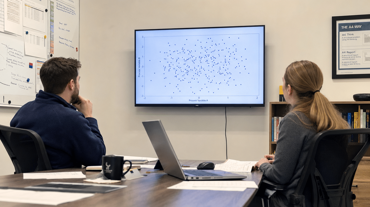
Scatter diagrams are useful when the cause-effect analysis points to variables that can be measured. A scatter diagram plots paired data so the team can see whether variation in one variable appears to move with variation in another. It can show a positive relationship, a negative relationship, or no visible relationship.

Scatter diagrams do not identify which variable causes changes in the other variable. Sometimes both variables are changing because of a third, unidentified factor. That is why it is usually best to develop and analyze the cause-effect diagram first, then use scatter diagrams to test the strongest measurable possibilities.
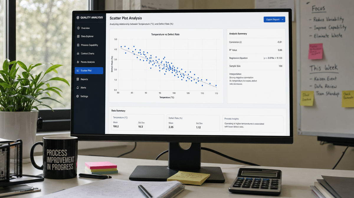
In the temperature example, changes in occupant comfort do not cause changes in room temperature, at least not until someone adjusts the controls. The team already understands the direction of the relationship. In other business processes, the relationship may be less obvious. More overtime may appear with more defects, but overtime may be a symptom of high demand, equipment downtime, training gaps, or scheduling pressure.
As an example, say the team is investigating why particulate emissions are high and varying in a random fashion. From a cause-effect analysis, variable fan speed has been identified as a possible cause. Fortunately, the team has daily data from the last fifty days on both indicated fan speed and lab sample particulate counts from the filter exhaust.
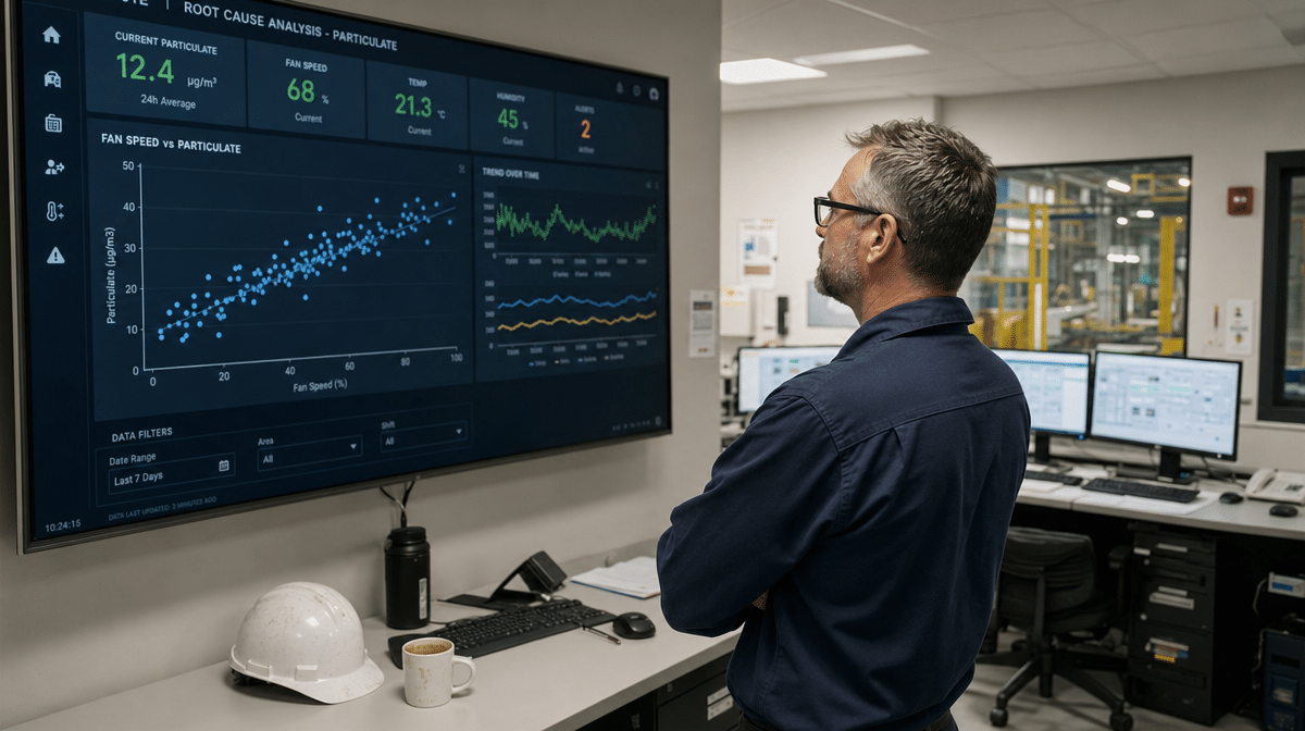
The resulting scatter diagram shows the situation more clearly. It appears, as a general rule, that particulate counts rise as fan speed rises. Because the data is dispersed, however, fan speed is probably not the only cause of this problem. The team should keep looking, using the scatter diagram as evidence rather than as a final answer.
How Should a Team Use the Diagram After It Is Built?
After the cause-effect diagram is built, do not let it become a meeting artifact that disappears into a file. Mark the causes that can be tested, assign owners for evidence gathering, and decide what data will confirm or disprove each likely cause. The diagram should drive investigation, not replace it.
A practical next step is to rank possible causes by likelihood and controllability. Some causes may be outside the team’s control but still useful to understand. Others may be directly controllable through procedure changes, training, maintenance, supplier follow-up, or better measurement.
When the root cause is confirmed, document both the cause and the corrective action. That documentation helps prevent the same problem from reappearing under a different name. It also gives future teams a clearer starting point when a related effect shows up elsewhere in the business.
Cause-effect diagrams are simple, but that simplicity is their strength. Any problem you are trying to solve can be viewed through a cause-effect diagram to understand symptoms, possible causes, and responses. A team is truly solving a problem only when it addresses the root cause. Otherwise, it is applying a temporary fix and waiting for the problem to recur.
Frequently Asked Questions
What Is a Cause-Effect Diagram?
A cause-effect diagram is a visual root-cause analysis tool that maps possible causes of a problem to the visible effect. It is also called a fishbone diagram or Ishikawa diagram because of its shape and origin.
Why Are Cause-Effect Diagrams Useful?
Cause-effect diagrams are useful because they organize brainstorming into categories instead of leaving possible causes as a loose list. They help a team move from symptoms to testable causes.
How Do You Build a Cause-Effect Diagram?
Start by defining the problem clearly, then write the effect at the head of the diagram. Add major cause categories, brainstorm possible causes under each category, and investigate the most likely causes with evidence.
What Is the Difference Between a Cause-Effect Diagram and a Scatter Diagram?
A cause-effect diagram organizes possible causes of a problem. A scatter diagram uses paired data to show whether two variables appear to move together, but it does not prove which variable causes the other.
When Should a Business Use a Cause-Effect Diagram?
A business should use a cause-effect diagram when a recurring problem has many possible causes or when different people see different symptoms. The tool is especially helpful before corrective action, process improvement, or quality-control work.