5 Effective Ways to Optimize Your Ecommerce Checkout Process

Every online store lives or dies at the same place: the checkout. A shopper can browse for twenty minutes, fall for a product, and add it to the cart, and still walk away in the final few seconds if the payment flow gets in the way. That last screen is where the sale is either won or lost, and it is where a clumsy process quietly inflates your cart abandonment rate. Organizing and optimizing the ecommerce checkout process should be one of your core objectives if your goal is to build a competitive advantage and remain relevant to your customers.
The trouble is that many ecommerce business leaders unintentionally put roadblocks in the shopper’s way as they approach the payment stage, whether through slow site speed, surprise fees, or complex forms. Each extra step is one more reason to leave. The five methods below tighten the ecommerce checkout process and strip out the friction that pushes customers toward an abandoned cart.
What Is the Ecommerce Checkout Process?
The ecommerce checkout process is the sequence of steps a customer completes to turn the items in their cart into a confirmed order. It usually covers entering shipping details, choosing a delivery method, reviewing the total cost, selecting a payment option, and confirming the purchase. A strong checkout moves the shopper through these steps with as little effort and uncertainty as possible.
It matters because this is the most expensive point on the site to lose someone. The shopper has already shown clear intent, yet checkout is where that intent most often breaks down. The Baymard Institute, which has studied online checkout usability and cart abandonment for more than a decade, puts the average documented abandonment rate near 70 percent, and a large share of that loss traces back to avoidable friction in the checkout itself. Optimizing it is one of the highest-return improvements you can make to your business processes.
Eliminate or Reduce Registration Forms
There are real benefits to a sign-up form. It is one of the better ways to gather customer information, build an email list, and grow a loyal following, and it remains a dependable lead generation tool. But that only holds if your customers are actually willing to complete the form before they buy.
In recent years, online shoppers have grown wary of filling out sign-up sheets at checkout, not because they distrust the brand, but because they do not have the time or the patience for it. They want to finish the purchase and move on. So do not force them to register before they can pay. Offer a guest checkout option that asks only for the few details you need to fulfill the order, and invite account creation after the sale is complete. Satisfied customers will come back and register on their own terms.
Combine Your Site and Checkout Domains
No matter how mature the ecommerce world becomes, people still get nervous when something unexpected happens during a purchase, and a sudden redirect is one of the most common triggers. If your checkout page sits on a domain that differs from your storefront, you are likely to lose first-time customers at the worst possible moment. Keeping shoppers comfortable through payment belongs right alongside your other financial performance objectives.
When a customer is bounced to an unfamiliar URL at the final step, it signals that they are no longer dealing with the brand they chose, even when that is not true. That flash of doubt is enough to send them looking for a store that stays consistent across its domains. If your ecommerce checkout currently hands off to a separate URL, ask your developers to bring it back under your primary domain or to mask it so the experience stays seamless from cart to confirmation.
Make the Checkout as Simple as Possible
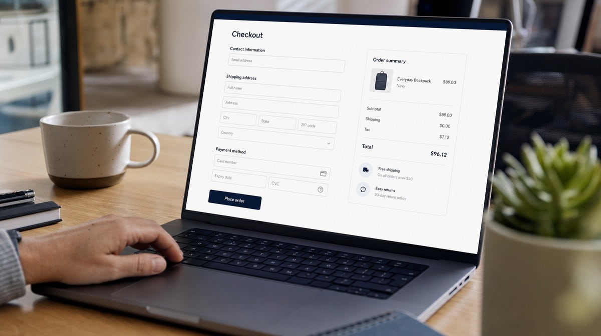
If you could fix only one thing, fix complexity. There is a difference between simplifying a checkout and dumbing it down, but the goal is the same: make every step clear, transparent, and obvious so the customer feels confident finishing the purchase. Shoppers dislike surprises, and complexity reads to them as risk.
Modern ecommerce design leans on streamlined layouts and single-page or single-screen checkouts that map the route from cart to confirmation in as few steps as possible, while still showing the information that builds trust. Strip out optional fields, autofill what you can, show a clear progress indicator, and keep the call to action visible at all times. Every field you remove is one less reason for the shopper to hesitate, and one more order completed.
Disclose All Fees Early
Some ecommerce managers save the full cost, including shipping, for the very last step before the confirmation page. It feels logical, but it backfires. Modern customers want to know exactly what a purchase will cost well before they reach that final screen, and an unexpected shipping charge at the end is one of the most reliable ways to produce an abandoned cart.
Surprise fees are a trust problem, not just a pricing one. The Federal Trade Commission’s guidance on online shopping stresses that the total price, shipping, and any added charges should be clear to the buyer up front. Much like building a sound content marketing strategy, the rule is to make the important information visible from the start. Show prices, shipping options, and any fees on the product page so customers can calculate their real cost before they ever reach checkout.
Optimize the Checkout for Mobile Commerce

Finally, it is time to fully account for mobile commerce. Shoppers increasingly browse and buy from handheld devices, often filling a cart on a phone during a spare moment and expecting to complete the purchase right there. If your ecommerce checkout is awkward on a small screen, you are leaving those sales on the table.
Make sure the entire flow is built for mobile, not merely shrunk to fit it. Use large tap targets, mobile-friendly input fields, and digital wallets that let customers pay without typing a card number, and adopt a layout that never forces pinching or sideways scrolling. A checkout that feels effortless on a phone turns idle browsing into completed orders, and it keeps your conversions climbing as mobile traffic grows.
How to Tell If Your Ecommerce Checkout Is Working
Optimizing the checkout is not a one-time project. Treat it as an ongoing part of your business processes and watch a few numbers to see whether your changes are paying off. The cart abandonment rate tells you how many shoppers leave after adding items but before paying. The checkout completion rate tells you how many of the people who start the checkout actually finish it.
Pair those with your overall conversion rate and the share of orders coming from mobile devices, then test one change at a time so you can see what actually moved the needle. Documenting the steps of your checkout and reviewing them on a regular schedule keeps small problems from quietly eroding your sales.
Wrapping Up
The checkout page is arguably the most important element of a successful ecommerce store, so it deserves real, ongoing attention. Reduce the forms, keep your domains consistent, simplify every step, disclose fees early, and build for mobile first. Apply these methods and you will give your ecommerce checkout process the best possible chance to turn shoppers into buyers.
Frequently Asked Questions
What Is the Ecommerce Checkout Process?
The ecommerce checkout process is the series of steps a customer follows to convert a cart into a paid order, including entering shipping details, choosing delivery, reviewing the total cost, selecting a payment method, and confirming the purchase. Optimizing it reduces friction and lifts completed sales.
Why Do Customers Abandon Their Carts at Checkout?
Most abandonment comes from avoidable friction: forced account registration, unexpected shipping fees revealed too late, long or confusing forms, a sudden redirect to an unfamiliar domain, and checkouts that are hard to use on a phone. Removing these obstacles recovers sales that would otherwise be lost.
Should You Require Account Registration to Check Out?
No. Requiring registration before payment is a common cause of abandoned carts. Offer a guest checkout that collects only the details needed to fulfill the order, and invite shoppers to create an account after the purchase is complete.
When Should You Disclose Shipping Fees?
As early as possible. Show prices, shipping options, and any added fees on the product page so customers can calculate their true cost before they reach checkout. Federal Trade Commission guidance on online shopping also stresses that total costs should be clear to the buyer up front.
How Do You Optimize a Checkout for Mobile?
Build the flow for mobile rather than shrinking the desktop version. Use large tap targets, mobile-friendly fields, digital wallets that avoid manual card entry, and a layout that never requires pinching or sideways scrolling, so customers can complete a purchase comfortably on a phone.