How to Use Control Charts for Continuous Improvement

A process can meet its target this week and still behave unpredictably. A control chart separates routine variation from signals that something changed, helping you decide when to investigate, when to standardize an improvement, and when to leave a stable process alone.
This guide explains how to choose between an X-bar and R chart and an individuals and moving-range chart, calculate a practical baseline, interpret control limits and signal rules, and use the result for continuous improvement.
What Is a Control Chart?
A control chart plots data in time order against a center line, an upper control limit, and a lower control limit. By comparing new observations with those lines and with non-random patterns, you can judge whether variation remains consistent or whether a possible special cause deserves investigation. The ASQ control chart guide describes this distinction between common-cause and special-cause variation.
A control chart does not identify the root cause by itself. It provides a signal that directs attention. That distinction matters because adjusting a stable process after every ordinary rise or fall can add variation instead of reducing it. If you need a refresher on the two types of variation, review common-cause and special-cause variation.
Which Control Chart Should You Use?
X-Bar and R Charts for Rational Subgroups
Use an X-bar and R chart when you can collect a small subgroup of comparable measurements at each interval. Examples include five parts taken from a production stream every hour or several transaction-cycle times sampled under the same operating conditions. The subgroup should be chosen so that the variation within it represents short-term process variation.
On an X-bar/R chart, X-bar is the mean of the observations in each rational subgroup, while R is the subgroup’s maximum minus its minimum. The X-bar chart monitors subgroup-to-subgroup movement in the process average. The R chart monitors changes in within-subgroup spread. The NIST X-bar and R chart guidance notes that subgroup sizes of four or five are typical, but the right size depends on the process and sampling plan. Five is not universally optimal, and X-bar is always the mean of the actual subgroup, not automatically the mean of ten measurements.
To plot the process average and range control charts, samples of product are obtained, usually at specified intervals, and measured. The sample size should be predetermined and then maintained. As the process is running, samples of in-process or finished product are randomly obtained and measured for the required characteristics. These measures are entered into the company SPC data collection system. The activity is repeated at the specified sample interval, such as hourly, for as long as the process is running. The purpose is to compare variation within each sample with variation between samples. When the two sources of variation remain consistent, the process is in statistical control and its variability is more predictable.
There are also control charts for attribute data, sometimes called the attribute type of data, such as counts or proportions. Do not force measured variable data and counted attribute data into the same chart. The average subgroup and subgroup range help compare within-sample variation with between-sample variation. Choose the chart family that matches the type of data and the way the process produces observations.
Individuals and Moving-Range Charts for One Observation at a Time
Use an individuals and moving-range chart, often called an I-MR or X-mR chart, when only one meaningful observation is available at each interval. Daily sales, monthly earnings, daily site traffic, a weekly defect cost, or the elapsed time for one recurring process can fit this pattern when grouping several observations would hide the time sequence.
On an individuals and moving-range chart, each moving range is the absolute difference between two successive observations. The individuals chart displays each value, while the moving-range chart shows short-term change between consecutive values. NIST gives the conventional individuals and moving-range formulas, including the 2.66 factor used when limits are estimated from moving ranges of two.
How Do You Build a Useful Control Chart Baseline?
1. Define the Measure and Sampling Plan
Choose a measure tied to the process outcome or an important driver. Define exactly when it is recorded, who records it, what units are used, and which operating conditions are included. Keep the subgroup size and collection method consistent. Randomly selecting product may be appropriate for a continuous manufacturing stream, while a business process may require one observation at each natural time interval.
2. Preserve Time Order and Context
Enter observations in the order they occurred. Record context such as shift, product type, staffing change, promotion, supplier change, outage, or procedure revision. Capable SPC software can calculate subgroup averages, subgroup ranges, process averages, control limits, standard deviation, and process capability, but features differ by product. The software does not replace a sound data-collection plan.
There are many types of software programs available for recording data and creating control charts. You can also calculate your own data points, process averages, ranges, and other statistics. Most organizations use software to calculate the subgroup average, subgroup range, process average, process range, control limits, standard deviation, and process capability. That is a lot of information, but it becomes useful only when the team understands how each measure supports a decision.
3. Collect Enough Comparable Baseline Data
A baseline should cover enough repeated operation to represent the process under comparable conditions. The NIST control-chart guidance describes at least 25 in-control subgroups of size four as a traditional starting rule of thumb. Treat that as a starting point, not a guarantee. Sparse data, a process change, seasonality, or changing operating conditions can make the initial limits unreliable.
As subgroup measures are entered into the system, the required calculations are performed and plotted on the control chart. The chart and data are not very useful until a sufficient number of data points, or subgroups, have been entered. Twenty-five subgroups can start to give you a picture of the process, but the picture becomes clearer as comparable data accumulates. Software may also let you isolate a specific shift or period, but segmenting the data is useful only when the selected period represents a meaningful operating condition.
4. Calculate the Center Line and Control Limits
Calculate the chart statistics that match the selected chart. For an X-bar/R pair, calculate each subgroup average and range, then the average of those values. For an individuals chart based on moving ranges of two, use the process average as the center line and estimate the three-sigma limits from the average moving range.
5. Review Signals Before Recalculating Limits
Plot the baseline and look for signals of special-cause variation. Investigate what happened at those times. Do not automatically delete an inconvenient point or recalculate the limits after every signal. Change the baseline only when the process has genuinely changed and the new period is sufficiently stable to support new limits.
Once a sufficient amount of data has been entered and a useful picture is obtained, several pieces of information become available. An SPC novice or untrained operator may see an unusual event or possible trend. A more experienced operator, manager, or engineer can examine process spread, control limits, standard deviation, and subgroup patterns. The picture flags a possible assignable cause; it does not replace the investigation needed to identify that cause.
How Do You Read Control Limits and Specification Limits?
Control limits describe process behavior, while specification limits describe requirements. Control limits are calculated from process data. Specification limits come from a customer, design, policy, regulation, or other requirement. A process can be stable but unable to meet its specifications, and an unstable process can temporarily produce acceptable results.
That distinction also changes how you use the process capability index, Cpk. Cpk compares the process center and spread with the nearest specification limit. For a capability study, first confirm that the process is sufficiently stable and that the distribution and measurement assumptions are suitable. The NIST process capability guidance explains the relationship between an in-control process and its specifications.
The original production-line example still makes the point. If Mike says line 3 is running at a Cpk of 0.63, the process needs attention against its stated requirements. If the Cpk is 1.4, the result may be encouraging. Neither number is a universal pass or fail on its own. The applicable specification, process stability, data quality, and business risk determine the decision.
In conversational terms, if you called your friend Mike and asked how production line 3 was doing and he answered, “We are currently running a Cpk of 0.63,” you would tell him there is work to do. If he answered, “Line 3 is running at a Cpk of 1.4,” lunch might sound more appropriate. The useful lesson is not the joke or a universal threshold. It is that Cpk measures the process’s capability of meeting the product specification being measured, after stability and assumptions have been checked.
Which Control Chart Signals Should You Investigate?
A single point outside a three-sigma control limit is the best-known signal, but useful patterns can occur inside the limits. The four supplementary tests below are commonly called the Western Electric rules. They are applied to Shewhart charts to flag patterns that are unlikely to be random:
- One point more than three sigma from the process average.
- Two of three successive points more than two sigma from the average on the same side.
- Four of five successive points more than one sigma from the average on the same side.
- Eight successive points on the same side of the process average.
NIST documents these supplementary control-chart tests and notes that extra rules also increase the chance of a false alarm. Select the rule set before reviewing the data, apply it consistently, and treat a violation as a prompt to investigate a possible special cause rather than proof that you already know the cause.
How Does the Weekly Sales Control Chart Work?
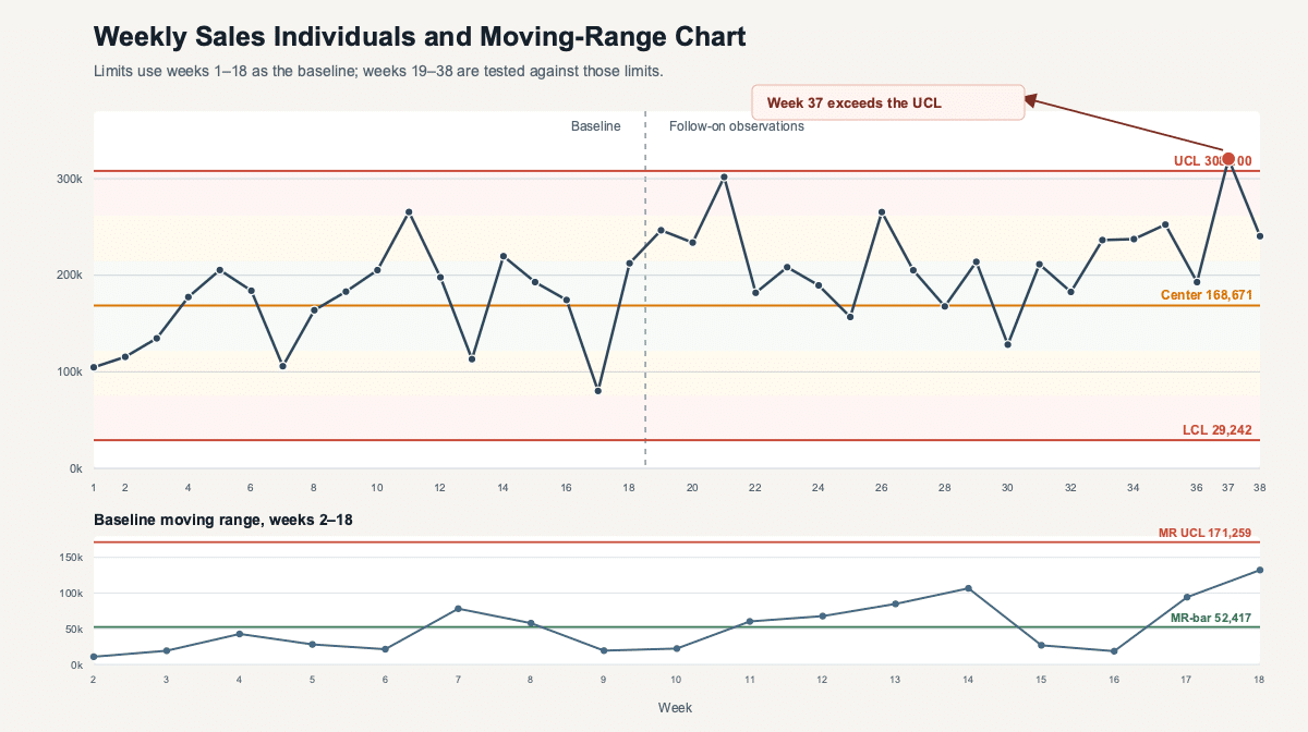
The following historical weekly-sales data is retained as an illustrative worked example. The first 18 weeks establish an individuals-chart baseline. The values range from 80,148 to 265,599, and their average is 168,670.5, rounded to a process average of 168,671.
For the previous 18 weeks, weekly sales varied from a high of 265,599 to a low of 80,148. The average weekly sales, or X-bar, is 168,671. With this data you can calculate the moving ranges between readings. Remember that the range is the absolute value, always positive, of the difference between successive readings. The calculated moving-range data is shown with the weekly sales below.
This is in contrast to a manufacturing process where you can randomly choose several representative products from the production stream, measure them all, and average the results. An individuals chart uses the measured value at interval t as the X measurement. The moving range uses the absolute value, always positive, of the difference between X at interval t and X at the previous interval.
| Week | Weekly Sales X | Moving Range MR |
|---|---|---|
| 1 | 104,679 | Not available |
| 2 | 115,537 | 10,858 |
| 3 | 134,696 | 19,159 |
| 4 | 177,393 | 42,697 |
| 5 | 205,437 | 28,044 |
| 6 | 184,038 | 21,399 |
| 7 | 105,863 | 78,175 |
| 8 | 163,746 | 57,883 |
| 9 | 183,134 | 19,388 |
| 10 | 205,348 | 22,214 |
| 11 | 265,599 | 60,251 |
| 12 | 197,901 | 67,698 |
| 13 | 113,093 | 84,808 |
| 14 | 219,758 | 106,665 |
| 15 | 192,949 | 26,809 |
| 16 | 174,363 | 18,586 |
| 17 | 80,148 | 94,215 |
| 18 | 212,387 | 132,239 |
The average moving range, MR-bar, is 52,416.94, rounded to 52,417. With moving ranges of two, the individuals-chart limits are:
For the period of the analysis, the average range has been 52,417. The process is highly variable, but the control question is whether the pattern is stable under the chosen rules. In this case the limits approximate three standard deviations from the process average by using the average moving range. Any point beyond those limits is a signal that the process may not be predictable under the baseline conditions.
- UCL = X-bar + 2.66 × MR-bar = 308,100.
- Center line = X-bar = 168,671.
- LCL = X-bar – 2.66 × MR-bar = 29,242.
No observation in the 18-week baseline crosses the three-sigma limits, and none of the four listed Western Electric rules fires in that period. That does not prove the sales process is free of seasonality or autocorrelation. It means that this illustrative series shows no signal under the selected rules and baseline.
To conduct a more refined visual analysis, divide the area between the control limits into six control zones bounded by plus or minus one sigma, two sigma, and three sigma. Because the three-sigma limits are already known, the one-sigma distance is one third of the difference between the process average and either control limit. In this example that distance is approximately 46,476. Adding the one-sigma and two-sigma lines makes the zone tests easier to apply consistently.
When plotted on a chart, the baseline shows no point beyond the upper control limit or lower control limit. That is not the end of the analysis. The additional zone rules account for time-series trends, process shifts, and other special causes of variability that may not violate the three-sigma rule. Even with these more detailed guidelines, the first 18 observations show no listed rule violation.
What Happens When Weeks 19 Through 38 Are Added?
The follow-on observations are 246,644; 233,876; 301,726; 181,823; 208,339; 189,499; 156,770; 265,408; 205,144; 167,705; 213,889; 128,115; 211,445; 182,777; 236,409; 237,402; 252,436; 192,923; 320,541; and 240,444.
Week 37 reaches 320,541, which is above the UCL of 308,100. Weeks 31 through 38 also form eight successive points above the process average. Both are special-cause signals under the selected rules. The upward movement may be desirable, but it is still an out-of-control signal. Investigate the timing, the promotion or process change, and other concurrent factors before attributing the result to one cause or resetting the limits.
How Do Control Charts Support Continuous Improvement?
A continuous improvement team can use control charts to choose the right response. When a special-cause signal appears, investigate the specific event and remove or standardize its cause as appropriate. When only common-cause variation remains but results are still inadequate, improve the underlying process rather than asking operators to chase every data point.
Regardless of your level of SPC understanding, control charts can provide valuable information about process variation. They help an operator, engineer, or manager decide when to take action and when not to take action. They also identify opportunities for improvement by separating a specific event from routine common-cause variation that requires a change to the process itself.
After a confirmed process change produces a sustained new level of performance, establish a new baseline and calculate new control limits. Keep the old chart and annotations so the team can see when the change occurred and whether the gain lasted. A chart can show that performance shifted after an intervention, but it does not prove causality without a sound evaluation design.
What Statistical Process Control Training Is Needed?
Anyone responsible for acting on a control chart should understand measurement, process variation, rational subgrouping, chart selection, control-limit calculations, signal rules, and the difference between stability and capability. A practical class can use a mini factory or another repeatable simulation so operators, engineers, and managers measure the same process, build the chart, and decide when to act.
In a mini factory, participants produce a product in realistic scenarios, complete with problems and management interference. Through measurement of the product and accumulation of data, the concepts of product variation and process variation can be explored. The data can then be used to understand SPC terms, develop a control chart, calculate control limits, and calculate the capability of the mini factory process to meet specification.
Working through the calculations for standard deviation, Cp, and Cpk gives the student a basic understanding of process variation and process control. The student should also understand when to take action, when not to take action, and how to identify opportunities for improvement. This type of exercise is suited to process operators, engineers, and managers who can use basic calculator functions and make the measurements required by the exercise.
Training should also cover what not to do: do not treat every fluctuation as a problem, confuse control limits with specifications, remove a point without a documented cause, or reset limits simply to make the chart look stable. The goal is not merely to calculate standard deviation, Cp, and Cpk. The goal is to make better process decisions.
Frequently Asked Questions
What Is the Difference Between a Run Chart and a Control Chart?
A run chart plots observations in time order. A control chart adds a center line and statistically calculated control limits, then applies defined signal rules to distinguish routine variation from patterns that merit investigation.
Can a Process Be Stable but Still Incapable?
Yes. A stable process can vary predictably while its output still falls outside customer or specification requirements. Stability describes behavior; capability compares that behavior with requirements.
When Should You Use an X-Bar and R Chart?
Use an X-bar and R chart when you can collect small, consistent rational subgroups at each interval and want to monitor both the subgroup average and the within-subgroup range.
When Should You Use an Individuals and Moving-Range Chart?
Use an individuals and moving-range chart when only one meaningful observation is available at each interval, such as one weekly sales total or one monthly earnings result.
What Should You Do After a Control Chart Signal?
Check the data, review annotations and operating conditions, investigate a possible special cause, and document what you learn. Do not recalculate the limits until a real and sustained process change supports a new baseline.