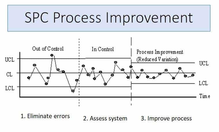
How to Use Control Charts for Continuous Improvement
Control charts are really two time-based charts plotted on the same form. For simplicity’s sake, we will focus on control charts for variable individual readings because this chart is usually most useful in understanding and improving business processes.
The most typical among control charts is the process average and range Control Chart, commonly called the X-bar and R chart. This type of data is measured or variable data, as opposed to attribute type of data. Please note that there are other types of Control Charts for attribute data.
Average and Range Control Charts
To plot the process average (X-bar) and range (R) Control Chart, samples of product are obtained, usually at specified intervals, and measured. The sample size should be predetermined and then maintained. Typical sample sizes are subgroups of 3, 4, 5, or 6 pieces, with 5 being the optimal. As the process is running, the samples, of either in-process or finished product, depending on what you are interested in controlling, are randomly obtained and then measured for the required characteristics. These measures are entered into the company SPC data collection system. This activity is repeated at the specified sample interval, say hourly, for as long as the process is running. Control charts produced from such data would be called an X-Bar and R chart. X-Bar is the average of the ten measurements within the sample and R is the range between the highest and lowest individual readings within the sample. The purpose of this one of the control charts is to measure the variations within the sample of ten specimens and compare those variations to the variations between samples. If the within sample variations are consistent with the between sample variations, the process is in control and the variability is predictable.
There are many types of software programs available for recording data and creating Control Charts, or for those eccentrics out there, one can calculate their own data points, process averages, ranges, and so forth. However, most of us will use software, which will calculate our subgroup average, subgroup range, process average, process range, control limits, standard deviation and process capability. “Wow! The software can provide a lot of information, but how is it used,” you may ask?
Control Charting Software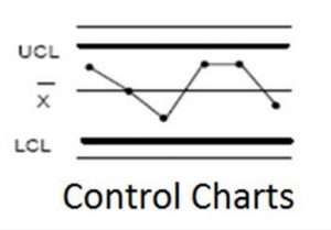

As the subgroup measures are entered into the system, a whole lot of calculations are performed and plotted or listed on the Control Chart. The chart and data is not very useful until a sufficient number of data points (subgroups) have been entered into the system and plotted. 25 subgroups will start to give one a good “picture” of their process, but as time passes and hundreds, and then thousands of subgroup data points have been entered and calculated, the “picture” of the process becomes even more accurate and clearer. One of the nice things about SPC software programs is that one can isolate any period of time, such as a specific shift, and display that time period’s specific Control Chart and other data.
Once a sufficient amount of data has been entered and a good picture is obtained, several pieces of very useful information are available. First of all there is a graphic “picture”. Even an SPC novice or untrained operator will be able to tell from the “picture” if there has been an event with an assignable cause or possible trends. The more experienced and trained operator, manager, or engineer will be able to exam the process spread, as identified by the Control Limits and the standard deviation or sigma, to determine if the process is “in control.” Then Control Chart graph can be observed for any subgroup trends to see if there is a high possibility of going “out of control.”
Continuous Improvements
The Continual Improvement team will look at these Control Limits and process variation to see if there may be opportunities for reducing this routine or common cause variation. As for myself I like to first glance at the picture, and then focus on the Process Capability Index or Cpk, which is a numerical index displayed to the side of the Control Chart Cpk for the process is calculated each time data from a process is entered into the system.
If I were to call my friend Mike and ask him how his production line #3 is doing today and his answer were; “we’re currently running a Cpk of .63.” My response would be; “Mike, you’ve obviously got some work to do; I’ll give you a call next week!” However, if Mike’s answer was; “Line #3 is running at a Cpk of 1.4,” my response would be; “Great! Let’s meet for lunch today and you’re buying!”
One thing to know is that there is a lot of misunderstanding of Cpk. Simply put, it is a measure of the processes capability of meeting the product specification that is being measured. Another way to look at it is, are the processes calculated control limits inside or with in the specification limits?
Regardless of your level of SPC understanding or your understanding of process variation, SPC and Control Charts will provide you with valuable information on your processes. If you are not sure if you’d be interested in better understanding your process variation and using SPC consider these statistical charts on the right.
Statistical Process Control Training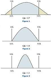
If you do not have a thorough understanding of what is depicted in each figure, and you want to understand and control your process variation, then you should consider taking a Statistical Process Control (SPC) class. In this class you will receive a quick basic review of Quality Control, followed by the development of a mini factory.
In this factory you will produce product in real-life scenarios, complete with problems and management interference. Through the measurement of your product and the accumulation of data, the concept of product and process variation will be explored and understood. Then the data from the mini factory product will be used to understand the various SPC terms and a Control Chart will be developed. The capability of the mini factory process to meet specification, Cpk, will be calculated.
Finally, to fully understand SPC and variation, problems are worked through in class to calculate the Control Limits, standard deviation, Cp, and Cpk. Upon completion, the student will have a basic understanding of process variation and process control. Additionally, the student will understand when to and not to take action on a process, as well as to identify opportunities for improvement. This class is suited for the process operator, engineers, and managers. As a prerequisite, prospective students should understand how to convert fractions to decimals, how to use a ruler to measure at least to eighths, and how to use basic calculator functions.
Control Charts for Individuals
Control charts for individuals are used when a sample size of one is the only sample available. Examples are daily sales numbers, monthly earnings reports, daily site traffic, or other metrics for which a multiple sample size is not available. This is in contrast to a manufacturing process where one can randomly choose ten representative products from the production stream, measure them all, and average the results.
An individuals chart does not allow a sample size of more than one. How do we then calculate a “range”, R. An individuals chart uses the measured value of the variable at interval “t” as the X measurement, and the absolute value of the difference between Xt and Xt-1 the previous interval as the range R. Let’s see how we can calculate the data necessary to plot an example of individuals control charts. The following data is derived from actual weekly sales data for an on-line business.
Weekly Sales X and R chart
|
Week
|
Weekly Sales X
|
|
1
|
104,679
|
|
2
|
115,537
|
|
3
|
134,696
|
|
4
|
177,393
|
|
5
|
205,437
|
|
6
|
184,038
|
|
7
|
105,863
|
|
8
|
163,746
|
|
9
|
183,134
|
|
10
|
205,348
|
|
11
|
265,599
|
|
12
|
197,901
|
|
13
|
113,093
|
|
14
|
219,758
|
|
15
|
192,949
|
|
16
|
174,363
|
|
17
|
80,148
|
|
18
|
212,387
|
|
Process Average
|
168,671
|
For the previous 18 weeks, the weekly sales has varied from a high of 265,599 to a low of 80,148. The average weekly sales, or X-Bar, is 168,671. With this data we can calculate the moving ranges between readings. Remember that the range is the absolute value (always positive) of the difference between successive readings. This calculated moving range data looks like:
Weekly Sales X and R Chart
|
Week
|
Weekly
Sales X |
Moving
Range R |
|
1
|
104,679
|
–
|
|
2
|
115,537
|
10,858
|
|
3
|
134,696
|
19,159
|
|
4
|
177,393
|
42,697
|
|
5
|
205,437
|
28,044
|
|
6
|
184,038
|
21,399
|
|
7
|
105,863
|
78,175
|
|
8
|
163,746
|
57,883
|
|
9
|
183,134
|
19,388
|
|
10
|
205,348
|
22,214
|
|
11
|
265,599
|
60,251
|
|
12
|
197,901
|
67,698
|
|
13
|
113,093
|
84,808
|
|
14
|
219,758
|
106,665
|
|
15
|
192,949
|
26,809
|
|
16
|
174,363
|
18,586
|
|
17
|
80,148
|
94,215
|
|
18
|
212,387
|
132,239
|
|
Process Average
|
168,671
|
52,417
|
For the period of the analysis, the average range, R-Bar, has been 52,417. Clearly, this process is highly variable, but is it in control? In order to determine that, we must calculate some control limits. In this case, control limits are an approximation of the statistical observations of a normal distribution. Any data point more than three standard deviations, designated +/- 3 sigma from the process average is out of control, and the process is not predictable. The 3-sigma limits are approximated by:
UCL = X-Bar + 2.66 x R-Bar
and
LCL = X-Bar – 2.66 x R-Bar
With the data at hand, the upper control limit is 168,671 + 2.66 x 52,417 or 308,100.
The lower control limit is 168,671 – 2.66 x 52,417 or 29,241.
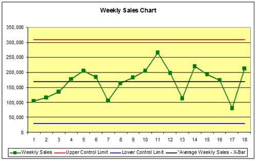
Figure 1: Control chart
When plotted on a chart this looks like the one on Fig. 1. We can immediately see that the process is in control based on the three sigma rule, but is that sufficient? Shewhart later modified his control scheme to account for other types of non-normal distribution such as time series trends, process shifts and other special causes of variability that did not violate the three sigma rule.
To conduct a more refined analysis we need to divide the area between the control limits into six control zones, limited by +/- 1-sigma, +/- 2-sigma, and +/- 3-sigma. Since we already have the +/- 3-sigma limits, we can obtain the +/- 1-sigma limits by dividing the difference between the process average and the control limits by three
X-Bar + 2.66 x R-Bar – X-Bar = 2.66x R-Bar/3 = 46,476
Adding the plus and minus 1 and 2-sigma lines to our control charts looks like:
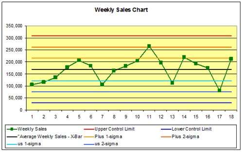
Figure 2: Shewhart’s modification – control chart with ± 1 and 2 sigma lines
Shewhart’s modification (Fig. 2) added a set of control rules, violation of any of which would constitute an out of control condition. These rules are:
- Rule 1 – any point outside the control limits (more than 3 sigma)
- Rule 2 – two out of three successive points more than 2 sigma away from the process average on the same side
- Rule 3 – four out of five successive points more than 1 sigma away from the process average on the same side
- Rule 4 – eight successive points on the same side of the process average
Even with these more detailed guidelines, we can not find any rule violations in this process, thus the process is in control.
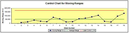
Figure 3: Control chart for moving ranges
Control charts are a good way to determine if a test change to a process, say a promotional offer, has a statistically significant effect on the process. To show how this might work, look at the following data from the end of the period analyzed above.
|
wk19
|
246,644
|
|
wk20
|
233,876
|
|
wk21
|
301,726
|
|
wk22
|
181,823
|
|
wk23
|
208,339
|
|
wk24
|
189,499
|
|
wk25
|
156,770
|
|
wk26
|
265,408
|
|
wk27
|
205,144
|
|
wk28
|
167,705
|
|
wk29
|
213,889
|
|
wk30
|
128,115
|
|
wk31
|
211,445
|
|
wk32
|
182,777
|
|
wk33
|
236,409
|
|
wk34
|
237,402
|
|
wk35
|
252,436
|
|
wk36
|
192,923
|
|
wk37
|
320,541
|
|
wk38
|
240,444
|
Add this data to the control charts data used above, plot the control chart using the process average and control limits already calculated plot the X and R individuals chart and answer the following questions:
- Is the process in control?
- If not, what are the rule violations?
- Is this a good or a bad situation?


Leave a Reply