How Do You Find the Correlation Between Variables?

You may know how to use cause-effect diagrams and scatter diagrams to identify the causes of problems and to quantify the impact of solving those problems. Before you try to understand control charts, you need to understand the concept of correlation. How do you find the correlation between variables?
How to Understand Correlation Between Variables
The term correlation between variables refers to a situation where two variables have a linear relationship that can be seen to change in a more or less predictable way. That is, if variable A increases from two to five, variable B is seen to change from 10 to 20. It is a basic part of correlation analysis.
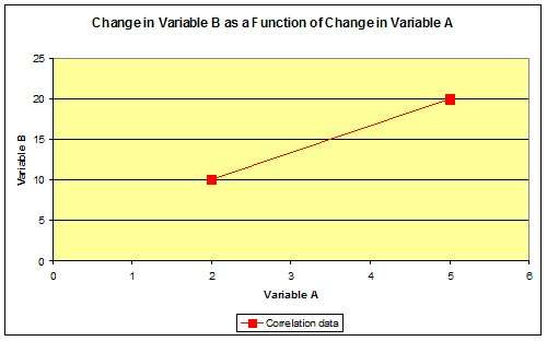
Chart 1: variable B increased 10 units while variable A increased by 3 units
In this instance, there is a unique solution defining a straight line passing through the two data points. Given this solution, we can predict that variable B will increase by 3.33 units for each unit increase in variable A. (Note on chart 1 that variable B increased 10 units while variable A increased by 3 units.)
What happens when variable A goes to zero?
That would be a decrease of two units in variable A multiplied by 3.33 giving:
Y0 = 10 – 3.33 X 2 = 10 – 6.67 = 3.33
Chart 2 shows this added data point as predicted by the above equation.
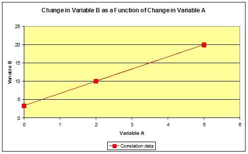
Chart 2: added data point as predicted by the equation, Y = 10 – 3.33 x 2
Life would be wonderful if every relationship, especially the human ones, were this predictable. But real life does not often present such simple solutions.
So, does a change in A cause a change in B? The very unsatisfying answer to that question is “We don’t know”. Correlation between variables tells us only that the two variables change in a predictable relationship to each other. Either may be the cause, or more often, both are affected by changes in some other causal variable. Be sure you know the situation before you assume a correlation between variables.
Correlation Using Scatter Charts
A scatter charts is one of the seven quality tools that is used to display a relationships between two variables (the dependent and independent variables). They can be used to determine the possible relationship or correlation between two variables. Chart 3 below shows a situation where the correlation between variables is not clear but less scattering indicates a strong correlation.
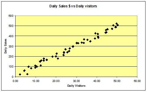
Chart 3: the correlation is not as straightforward as before
Determining Correlation Using a Best Fit Chart
Here we have a plot of daily sales dollars versus the number of daily visitors. Notice that with all of the data (50 data points) there is no unique solution, and picking any two points to draw a line through could greatly affect our conclusions regarding average sale per visitor.
Here though, we can make a judgment and simply draw a straight line through the data to determine correlation between variables. This is what is done using linear regression. Try to keep half the data on each side of the line and it’d probably look like what chart 4 shows.
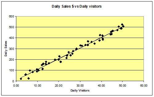
Chart 4: the “best fit” line
Using our “best fit” line, we conclude that the average visitor buys about $10.00. We know this because at 10 visitors, the line passes through $100 and at 50 visitors, the line passes through $500. This data still represents a pretty close fit.
Chart 5 shows the data from our fan-filter problem. How do we draw a line through this mess? We really can’t draw such a line with any degree of confidence because there seem to be other factors that affect contaminant levels. Can we draw any conclusions from this data in regards to correlation between variables? Here’s a fairly simple test called the medians method.
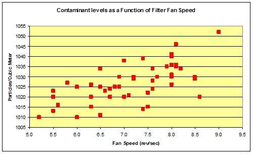
Chart 5: data from the fan filter problem
There is much confusion about the meaning of terms like average, mean and median. We need to clear up that confusion. Mean and average are identical. They are both calculated as the sum of the data readings divided by the number of readings. Using our fan data, the average or mean fan speed is 7.1 revolutions per second and the average or mean contaminant level is 1,027 particles per cubic meter.
Determining Correlation Using the Medians Method
Median is not a calculated but rather an observed value. If we were to sort the data from lowest to highest, the median reading would be that for which half of the readings were higher and half were lower. For our fan data the median fan speed is 7.2 revolutions per second and the median contaminant level is 1,026 particles per cubic meter. Note that the medians and averages for this example are quite close. That is because the data is relatively normal in distribution.
If we draw a line for each variable representing its median, the resulting chart looks like the following:
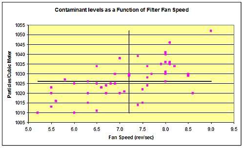
Chart 6: Medians Method: draw line for each variable representing it’s median
Notice that the addition of the median lines has divided the chart into four quadrants, I, II, III, and IV as shown. For the median method, we count the number of points in each quadrant. There are 18 points in quadrant I, 4 points in quadrant II, 19 points in quadrant III, and 5 points in quadrant IV.
To determine if there is a correlation between variables, we add the number of points in quadrant I and III, and add the number of points in quadrants II and IV. These totals are 37 and 9 respectively. Looking at the lower number, we refer to a table of limit of number of points as shown. Notice that there are a total of 46 points in the four quadrants. That is because there are four points on the lines. Therefore N=46.
|
N
|
Limit Number of Points
|
N
|
Limit Number of Points
|
|
20
|
5
|
46
|
15
|
|
21
|
5
|
47
|
16
|
|
22
|
5
|
48
|
16
|
|
23
|
6
|
49
|
17
|
|
24
|
6
|
50
|
17
|
|
25
|
7
|
51
|
18
|
|
26
|
7
|
52
|
18
|
|
27
|
7
|
53
|
19
|
|
28
|
8
|
54
|
19
|
|
29
|
8
|
55
|
20
|
|
30
|
9
|
56
|
20
|
|
31
|
9
|
57
|
20
|
|
32
|
9
|
58
|
21
|
|
33
|
10
|
59
|
21
|
|
34
|
10
|
60
|
21
|
|
35
|
11
|
61
|
22
|
|
36
|
11
|
62
|
22
|
|
37
|
12
|
63
|
23
|
|
38
|
12
|
64
|
23
|
|
40
|
13
|
66
|
24
|
|
41
|
14
|
67
|
25
|
|
42
|
14
|
68
|
25
|
|
43
|
14
|
69
|
26
|
|
44
|
15
|
70
|
26
|
|
45
|
15
|
||
For N= 46, the limit of number of points is 15. Our sum of quadrants II and IV is 9, the lower total of the two sums. This is less than the limit of number of points of 15 according to the table, thus there is a positive correlation between fan speed and filter effectiveness.
Understanding Correlation Between Variables
Understanding the concept of correlation and analyzing the correlation between variables data can help you to quantify the impact of one variable on another when your are solving a problem. It as all a part of improving processes with six sigma tools.


Very important clarification, thank you.